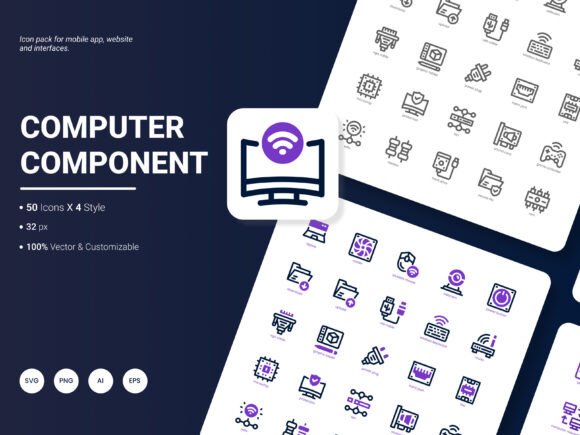
Computer Component Icon Pack: A Practical Resource for Modern Digital Projects
Finding the right visual elements for a project often takes longer than expected. You spend hours browsing through scattered collections, testing different styles, and still end up with icons that feel mismatched or outdated. The Computer Component Icon Pack was built to solve exactly that kind of friction. It’s a curated set of 200 icons that cover the territory many designers, developers, and content creators find themselves navigating repeatedly—technology, hardware, software interfaces, and digital services.
What makes this particular collection stand out isn’t just the volume. It’s the fact that someone already thought through the format problem. You get the same icons in AI, EPS, SVG, PNG, PDF, and JPG formats. That alone removes a surprising amount of conversion hassle when you’re moving between tools like Figma, Illustrator, PowerPoint, or a code editor. And with four distinct styles available, you’re not locked into a single visual direction before you even start.
Where the Computer Component Icon Pack Fits Into Daily Work
Most people don’t need icons just to have icons. They need them to communicate something quickly and cleanly. A developer building a dashboard for a SaaS product might pull from this pack to label navigation items. A marketer putting together an infographic on cloud migration could use the server and networking icons to make abstract concepts tangible. A technical writer documenting software architecture might insert the relevant component icons to break up text-heavy pages and guide the reader’s eye.
The pack spans a wide range of computer-related imagery—processors, memory modules, motherboards, storage devices, peripherals, connectors, and more abstract symbols for cloud services and data transfer. That breadth means it covers both literal hardware topics and the metaphorical digital concepts that businesses talk about every day. When you need to represent “processing power” or “data throughput” in a slide deck, having a crisp, recognizable icon saves you from reaching for generic clip art that dilutes your message.
Designers Working Across Multiple Client Demands
Freelance designers and agency teams often juggle projects in completely different industries within the same week. Monday might be a landing page for a cybersecurity startup. Wednesday could be an explainer video storyboard for a cloud storage company. Friday might bring a last-minute request for trade show booth graphics from a hardware manufacturer. The Computer Component Icon Pack provides a consistent visual library that travels across those contexts without requiring a new hunt for assets each time.
Because the icons are editable—vector files that let you change colors, stroke weights, and individual shapes—you can adapt the same icon to fit minimalist branding and more illustrative, colorful projects. A designer working with a strict brand palette can recolor an entire set in minutes. Someone building a dark-mode interface can invert treatment easily. The flexibility reduces the urge to compromise on visual cohesion just because the default icon color doesn’t match.
Developers and Product Teams Building Interfaces
For developers working on admin panels, user dashboards, or system monitoring tools, icon consistency directly impacts perceived professionalism. When one icon has a 2px stroke and another has a 3px stroke, users notice—even if they can’t articulate why something feels off. The multi-style approach of this pack helps maintain uniformity. You can pick a line style, a filled style, a duotone, or a more detailed illustration style and commit to it across the entire interface.
SVG availability is particularly useful here. Developers can inline the SVGs, animate them if needed, or manipulate them with CSS. For mobile app teams, the PNG exports at various resolutions cover the standard density buckets without extra processing. There’s less back-and-forth between designers and developers over asset formats because the deliverables already cover the common ground.
Content Marketers and Data Storytellers
Blog posts and whitepapers about technology topics often suffer from monotonous visuals. Stock photos of server rooms only go so far, and they rarely illustrate specific technical points. The icons in this pack let content teams create custom header images, data highlight callouts, and process diagrams that feel tailored to the article’s subject. When writing about edge computing versus centralized cloud architecture, distinct icons for local processing units and remote data centers clarify the comparison before the reader even processes the words.
Infographic designers benefit especially from the popular content coverage. The icons address not just hardware components but broader digital transformation themes—security shields, network nodes, user authentication symbols, analytics graphs, and mobile device outlines. That thematic range supports storytelling about technology trends without requiring a separate icon source for each subtopic.
Presentation Design for Internal and External Audiences
IT managers, product leads, and consultants often present technical roadmaps to stakeholders who don’t share their depth of knowledge. A well-chosen icon next to a timeline milestone—say, “Database Migration Complete”—provides instant context. The audience registers the visual cue and stays oriented, even if the specific technical terms bounce off. Because the Computer Component Icon Pack includes file formats like PDF and JPG alongside the more design-oriented formats, non-designers can drop these directly into PowerPoint, Google Slides, or Keynote without intermediary steps.
What many presentation builders discover is that icon consistency across slides subtly elevates the entire deck. When slide 4 uses a certain style of network icon and slide 12 uses a completely different style pulled from a separate source, the presentation feels patched together. Using a single pack keeps the visual language aligned from start to finish with minimal effort.
Educational and Training Material Creation
Trainers and instructional designers producing courses on hardware fundamentals, IT certification prep, or software onboarding find the literal component icons particularly valuable. Showing a labeled diagram of motherboard components with matching icons helps learners connect abstract technical names to physical objects. The editable nature of the vectors means trainers can simplify or emphasize certain parts of an icon to suit the pedagogical goal—maybe enlarging the CPU icon while dimming surrounding support components to focus attention.
E-learning platforms that serve global audiences also appreciate that icons transcend language barriers. A well-designed memory module icon communicates the concept regardless of the learner’s native language, reducing the translation burden for course localization teams.
What to Consider Before Integrating the Pack
Like any asset collection, the Computer Component Icon Pack works best when you know what you’re looking for. The 200 icons cover popular technology content thoroughly, but niche or highly specialized equipment might not appear. If your project requires icons for a specific proprietary hardware line or an obscure legacy connector, you may need to supplement. That said, the editable vector foundation makes it possible to modify existing icons as starting points rather than building from scratch.
The four styles provide variety, but they also require a decision. Some teams spend too long debating which style to use across a project. A practical approach is to sample two or three styles in context early—place them in the actual interface mockup or slide background—and see which one reads clearly at the intended size. Icons that look crisp at 200px might lose detail at 24px. Testing early avoids rework later.
File management is another quiet consideration. With six formats per icon and 200 icons, the total file count can be substantial. Organizing them into folders by format and style right after download saves searching time down the line. Many users tag the formats they use most—often SVG and PNG—and archive the rest for future needs.
How Different Audiences Extract Different Value
A technical illustrator might never touch the JPGs but will deeply appreciate the AI and EPS files that integrate smoothly into Adobe workflows. A social media manager creating quick tech-related posts might only ever use the high-resolution PNGs and never open a vector editor. A UX team lead might distribute only the SVG set to the design system folder and treat the rest as backup. The pack doesn’t force a single usage pattern, which means different roles within the same company can adopt it in parallel for distinct purposes.
This flexibility also matters when projects evolve. A startup might initially use the icons in a pitch deck, later in the product wireframes, and eventually in the launched application’s interface. The same visual DNA runs through all those touchpoints, creating an accidental but beneficial brand consistency that audiences feel even if they never notice the repetition consciously.
Staying Current and Requesting Updates
Technology moves fast, and icon libraries age if they don’t evolve alongside industry shifts. The team behind the Computer Component Icon Pack has explicitly invited suggestions for future updates, which signals a willingness to keep the collection relevant. Users working in emerging areas—quantum computing visual metaphors, AI accelerator hardware, chiplet architectures, or new connectivity standards—might consider submitting specific requests. Other users have likely asked for expanded networking abstractions, more biometric security icons, or updated mobile device shapes that reflect current form factors.
One practical strength worth highlighting is that the pack already covers popular services and ideas, not just physical components. That means cloud computing concepts, data flow representations, cybersecurity symbols, and user interaction metaphors sit alongside the literal hard drives and RAM sticks. The blend of concrete and abstract makes the set more versatile than a pure hardware reference collection would be.
Real-World Moments Where This Pack Solves a Problem
Imagine you’re putting together an analytical report on IT infrastructure spending. You have tables of data and projections, but the document feels dense. Adding small, consistent icons next to expenditure categories—server hardware, cloud subscriptions, networking equipment, cybersecurity tools—immediately makes the information scannable. The icons act as visual anchors that help executives flip through the report and land on sections relevant to their questions.
Or consider a mobile app onboarding flow that explains how the app connects to external devices. Step-by-step screens using relevant component icons guide users through the pairing process without relying solely on text instructions. The icons reduce cognitive load at the exact moment users might feel uncertain.
A website designer building a services page for an MSP can use the icons to illustrate managed offerings—monitoring dashboards, backup solutions, firewall protection, help desk support—in a way that feels cohesive rather than cobbled together from different free icon sites. The professionalism of the result affects how potential clients perceive the company’s attention to detail.
The Computer Component Icon Pack ultimately serves as a dependable foundation layer for visual work that intersects with technology. It doesn’t try to be everything for everyone, but in the domain it covers, it eliminates a lot of the friction that usually comes with finding, converting, and matching icons across projects. That reliability matters when deadlines are tight and the difference between a polished deliverable and a rushed one is often just the quality of the smallest visual elements.